Armani Print Advert
Victoria & David Beckham
Image Analysis
(Jonathan Taylor)
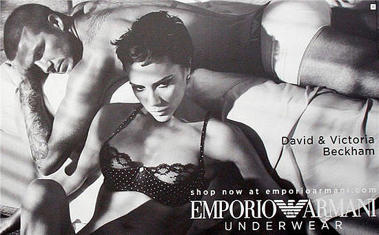
This advert-photograph displays and denotes 2 human-models,
1 presumably male and 1 presumably female. Both are shown semi-nude, wearing
only the brand’s underwear. The models are in fact 2 globally famous
celebrities, aswell as a married couple, David and Victoria Beckham. Both
models are signified on the image, but a signifier is also used, where the
names are shown in text, maybe as a reminder as to who they are if the image is
unclear.
Firstly, I analysed the body language of the models and have
written my denotations: David is seen lying on what appears to be a bed, his
head is tilted slightly towards the camera lense and his eyes are slightly seen
looking into the camera lense. David’s left arm is slightly flung over the bed,
with his hand reaching back up to the bed so his arm creates an almost triangular
shape.
David’s head tilting, corresponding with the shadows of the
image, darkens his eyes, creating a dark, mysterious mist to them, creating
an almost ‘bad-boy’ image. His eyes are looking directly into the lense, this
is to draw the audience in, as you might make ‘eye-contact’ with him, causing
you to carry on looking at the image, the idea of staring also gives off this ‘bad-boy’
impression. David’s arm is flung over
the bed, this positioning emphasises his muscular arms, thus connoting
masculinity, strength and again, relating to this edgier ‘bad-boy’ image.
The representation of Victoria
is unique, in comparison to a lot of female lingerie-model photos, in a sense
that Victoria
doesn't appear very/strongly feminine. In fact, the photograph seems to play along
to this idea that Victoria
is more ‘masculine’ and based on stereotypes, contains more masculinity, with
really the only obvious strongly female element in the photo, being her breasts.
Her hair is cut short, her shoulder/collar-bones are very prominent and her strong
accented jaw-line is strongly defined; all these edgy, darker, rawer looks give
a stronger vision of masculine than feminine. The focus on the breasts could
also be linked to how much they want to put focus on the underwear she is
wearing, as her Armani branded bra appears at the only really obviously female
element of the photo. The masculinity portrayal is almost definitely to connote
and reflect the more modern, realistic and non-misogynistic images of women,
where they can cut their hair short etc. and they don’t have to conform to
gender-norms, they can carve their own style, be independent. So by using a neutral
ground of masculinity to represent strength for both the male and female genders,
who are wearing the brands in the photo, the brand is trying to seem more accessible,
empathetic, modern and moral.
I denoted that the use of colour (or lack of) along with
shadows and lighting is important in the picture, due to the heavy emphasis on
the black/white shades used throughout the picture. The picture, during editing
seems to have been boosted in level of Contrast and possibly sharpness. The seemingly
heavy amount of shadows and lighting physically made with actual lights/shading
effects in the photograph location, when actually taking the original
pre-editing photograph will have also boosted the colour contrast between the
black/white colourings, where the lighting will have boosted the amount of white
colour and shadows boosted the amount of black. This happens due to some of the
lighter/darker shades of grey, becoming altered into the nearest shade, so
white/black, so shortening the colour/shade palette down.
The removal of colour, having the photo in black and white
automatically connotes elements of class, sophistication and professionalism,
due to the nostalgic quality colourless photos can have, as they can be seen to
replicate old photographs from the 1950’s etc Or they may be seen to be much
more dramatic, due their lack of colour, so your eyes are drawn to other
elements of the photograph, such as the shading of light/dark and the various
shapes within the image. The editing with contrast and sharpness relates back
to this, the dark elements create a dark, broody, masculine and more sexual
tone than if the contrast hadn't been altered, due to quality of white/black
and the symbolic connotations of these colours, e.g. black = dark, cool,
classy.
The use of cropping, aswell as the use of foreground/background
imagery focus is incorporated into this image. The photograph could easily have
been cropped from a full photograph, as the picture seems to perfectly fit
(maybe too perfectly for an original photograph shot) around where the two
models body’s end/start. The foreground is more emphasised upon, with almost no
real foreground at all, besides the presence of a bed.
A narrative suggestion is shown here. The idea of the 3
objects in the picture being David ,
Victoria
Both models, as previously mentioned are hugely famous
celebrities, both in their own right and even as a couple. The use of
celebrities rather than your ‘average-Joes’ or even other models, is due to
their popularity, pre-existing fan-bases and wide-spread appeal. The celebrity
status is used to connote power and wealth within the brand, because ‘if
celebrities wear it, then it must be of a good quality’. There is definitely an
element of sex-appeal being used in the image. The semi-nudity, wearing only
underwear is almost a ‘revealing’ of the person underneath the celebrity, but
still keeping their ‘modesty’ retained; this connotes status, prowess and provocative,
giving you something to be shocked, confused or even aroused by, to draw
attention to the advert, how these high-profile celebrities are almost baring
all. However, the image is only cleverly and subtly sexual as opposed to overtly, by showing full nudity and them quite lying on a bed in some form of embrace etc. as to not cause ethical issues, affecting
children and such due to inappropriate content being displayed publicly, where
the adverts would most likely be on billboards in public places. This would
reduce the negative impact on the audience (and so the audience's reception) that was not targeted during this
advertising campaign, while still being most effective by being shown publicly
around public places.
No comments:
Post a Comment
What do you think?
Note: only a member of this blog may post a comment.