The representation of old people in Pride is extremely broad. The film shows a variety of different opinions of the gay community, there are some traditional views where as others are much more accepting of the gay community and others are simply just interested and want to learn more.
Gwen is a character that has a lack of knowledge of the gay community suggesting that she hasn't been exposed to information of the gay community. She is interested and wants to learn more and when she asks "are all lesbians vegetarians" it shows just how clueless she is of that topic area. The one liners that Gwen has contradicted the stereotypical 'little old lady' as it is unusual for an old woman to ask such provocative questions to people that she has only just met "How'd you get into that leotard then?"
Clifford is yet another character who is slightly uneducated even though he is gay himself. He has hidden the fact that he is gay for so long that he does not know how to come to terms with the fact that he is gay as he is in fear of rejection. Due to the fact Maureen married his brother it is instilled into him that being gay is wrong as Maureen is constantly informing him of how it is disgusting and his brother would not be happy with him interacting with gay people. This reinforces the traditional ideologies of the time and place the film is set, as well as the character of Maureen highlighting these themes. Clifford's character represents gay men who live in fear of coming out as they are scared of rejection so they simply live a lie, whereas Maureen represents traditional views of the 1980's which is extremely homophobic. These two characters have a lot of conflict between each other as it seems as if Clifford is attempting to accept who he is but Maureen is constantly trying to push him back into 'the closet'.
A scene that shows this conflict would be where the vote has been done and it was decided that the miners can no longer accept money from LGSM and Clifford says to Maureen "this is not what my brother would have wanted" this shows how Clifford has broken away for the traditional views and is willing to accept himself whereas Maureen is completely against accepting gay people even if that leads to a family breakdown.
Showing posts with label Abbie Atherton. Show all posts
Showing posts with label Abbie Atherton. Show all posts
Gay rights movement 1980s research
-In 1985, a new law made it illegal "to commit an act of gross indecency with another male, in public or private." - People were prosecuted for homosexual acts and were often imprisoned.
-The writer Oscar Wilde was sentenced two years imprisonment- He later became an inspiration to generations of gay men who were forced to conceal their sexuality.
- 1979 - First ever gay television series Gay Life commissioned by LWT.
-1980- Male homosexuality was decriminalised in Scotland.
-1982- Male homosexuality decriminalised in Northern Ireland
- 1982 - UK's first HIV/AIDS charity launched.
-1983- BBC Panorama first documentary on AIDS
-1987- The International Foundation for Gender Education (IFGE) is founded to promote acceptance for transgender people.
-1988 - Denmark becomes the first country in the world to give legal recognition to same-sex partnerships
-1988- Thatcher introduces Section/Clause 28 - act states that a local authority "shall not intentionally promote homosexuality or publish material with the intention of promoting homosexuality" or "promote the teaching in any maintained school of the acceptability of homosexuality as a pretended family relationship".
-1988- Sir Ian McKellen comes out of UK's BBC Radio in response to the government's proposed Section 28 in the British Parliament.
-1988- Stonewall UK is formed in response to Section 28 and other barriers to equality. Founding members include Sir Ian McKellen and Michael Cashman
Women's Magazines Objectify Women Just as Much as Men's Magazines Do
Noah Berlatsky - The Atlantic
"Men's magazines are mostly based around heavily eroticised images of women. And women's magazines are also based around heavily eroticised images of women."
"Alex Bilmes.." (Journalist, Editor of Esquire UK) "..admitted that the women in the men's magazines were objectified."
"We provide pictures of girls in the same way we provide picture of cool cars. It is ornamental. Women's magazines do the same thing." - Placing a woman and a car within the same category represents her as an object.
Alex bilmes "went on to argue that women's magazines enforce more rigid and damaging beauty standards."
"The reason images in men's magazines often look like images in women's magazines is that, despite the different audiences, they are both doing more or less the same thing" -- "They are making women sexual objects, and serving them up to satisfy, or more likely provoke, the desires of their readers."
Men's magazines are "telling men that female bodies are objects to be used for their enjoyment."
"The fact that women are assumed to be the objects, not just in men's magazines, but in women's as well, indicates just how prevalent, and how constricting, gender expectations can be."
David Gauntlett - Media, Gender and Identity
Media, Gender and Identity
"Femininity on the other hand is not necessarily seen as the state of 'being a woman'; instead, its perceived more as a stereotype of a woman's role from the past" - Many magazines/adverts use the traditional role of the woman as the representation, instead of using a more up-to date one as "Femininity is not typically a core value for women today." (p.g. 12)
When discussing the role of masculinity, Anthony Clare 'On Men: Masculinity in Crisis' states that "Men used to know their place, as provider for their family, says Clare, and this was a role to be proud of. But today, as women show that they can do everything that men can, the provider role becomes diminished." - he then later states that the mass media and popular culture aid men to "adjust to a contemporary life." (p.g.10)
Women's Magazines in the past
"Today there is a well-known, comical stereotype of the ways in which women''s magazines and adverts used to address women as simpering housewives whose dream was to impress their authoritative, working husbands" (p.g 41)
"The advice offered to women was not about how to fulfil their own potential, but was instead focussed on bringing happiness to their family." (p.g. 41)
The 'cosmo' Factor
"Cosmo was playing playboy at its own game, seeing sexual pleasure as important, and suggesting that women were entitled to it" (p.g. 44)
"cosmo does not bother being consistent : one article would encourage readers to be happy with their body size, whilst another would encourage slimming." (p.g. 44)
Men's Magazines + Modern Masculinities - Chapter 8
"Magazines like Loaded, FHM and Maxim are an attempt to override the message of feminism, promoting a 'laddish' world where women are sex objects" - (p.g. 164)
Lads mags have "found a way to combine traditional male pleasures with a post-feminist discourse" - (p.g. 166)
Reinscribing Sexism
"The view that they are sexist is often based on the observation that the magazines usually contain several pictures of women wearing clothes which are small, or not there at all" -(p.g. 182)
"Some magazines for women do the same thing back to men" - (p.g. 182)
"Alluring pictures of semi-naked women could specifically be said to be sexist because this feeds into the objectification of women" - (p.g. 183)
Dead Island Trailer Analysis
Dead Island
The trailer begins showing the two parallel strands of the narrative development. One being the dead girl and the other is the family attempting to save her. At first the audience would speculate that the trailer is non-linear, as the shots are not shown to be linked in order of time, however this adds to the emotional response, as the endings connotations change due to the order. As the trailer is played in reverse order, the two narratives meet at the same point, but the meaning behind the meeting shot changes. If it were played in order of time, the girl would be picked up and taken into the hotel room by her father, but as it is played backwards, it conveys the father sacrificing his daughter to the zombies, as she has already been bitten.
The trailer starts by tracking back from an extreme close-up of an eye, once we are able to see the face, the audience is able to see that it is a little girl lying on the floor. This would cause the audience to have enigma codes, as they will want to know what happened to the girl and why. The close-up of the eye allows the audience to create a bond with the young girl, as it is her story we are following throughout the trailer.
The shots that are played in reverse are shown in slow motion, as this draws out the emotional response from the audience, as they are forced to watch for a longer period of time, whereas the shots going played forward are without slow motion, this is due to the fact that in these shots there is still a slight chance of survival, whereas in the reversed shots she has already died. Supporting this, in the reversed shots, the audience are unable to hear any diegetic sound. Slow, sad music is played over the top which works as a contrast to the heavy breathing and zombie grunts. This acts as an aural signifier of her life, as we are able to hear as she does when in the narrative of her family trying to save her.
The trailer shows multiple conventions of a zombie survival game, as there are certain aspects that the audience have come to expect when zombies are involved. Such as the heavy use of gore and violence, and the use of the typical zombie appearance, which involves open jaws and ripped skin, as this conveys that they are no longer alive.
Throughout the trailer the audience are placed in a position of observation, as this allows them to see everything that is happening. There is one shot in which the audience are in the position of the zombie's point of view, which causes the audience to feel more connected in the narrative. This shot also conveys the helplessness as the audience are unable to do anything to stop the inevitability of the girl's death happening.
Research and Analyse a specific genre of TV show
Horror
Typical examples of Horror:
Straight away from the music used the audience is made aware of the tone of the show, the music seems to be quite sinister and fast pace, which shows the audience that the show will also have the same features. The editing is also fast paced and works with the music to add suspense to what will come in the episode.
The visuals with each actors name is an object which represents their character, for example, 'Norman Reedus' is shown with a leather vest with wings whilst looking through the wheel of a motorbike, this is essential as in most series he wears that leather vest and is known as the character with the motorbike.
Andrew Lincoln is shown first as he is the character who plays the 'leader' of the group, it also shows various weapons, including his sheriff pistol, which connotes that his character is quite violent and is willing to fight for 'his' group.
Setting
The settings vary for this show in particular, as it is set in a post-apocalyptic world, the characters are unable to stay safe in one place for a long period of time. The first few seasons were set in a forest, as the group had no safe place where they could stay.
 Most horror series tend to be shot in a city/town that is essential to the story, for example Game of Thrones is set in towns that are named in the books which the show was created from. Much like this, The Walking dead choose locations where it will help the stories develop in the ways they want.
 After the forest, the group move on to various places before they find the prison, this is the place they stay for around a season and a half, as it was seen to be a safe and protected place for the group to live in. Throughout all of the series, the group still end up back in the forest, as they learn that no place is really safe and it is best to keep moving.
Technical Codes
In most horror series, the editing always seems to be fast paced, as it keeps the audience expecting something to happen at any moment. Close up shows are used quite often so the audience is able to connect with the character and are able to feel the emotions that the character is trying to portray. Also, wide shots are frequently used, as it allows the audience to see things in the background that the character may not be able to see, which would create suspense as the audience would feel they know something that the characters need to know.
Generally in this type of show, non-diegetic sound, especially music is used to create suspense for something about to happen, such as a walker appearing and attempting to kill a character.
Characters & Representations
Typical examples of Horror:
- The Walking Dead
- Fear The Walking Dead
- Supernatural
- American Horror Story
- Penny Dreadful
- The X Files
- Bates Motel
- True Blood
- Game Of Thrones
The Walking Dead - This show has gained popularity in the world of post-apocalyptic horror. The show focusses on a sheriff called Rick Grimes and how he leads his group in a world taken over by walkers.
Format
This show is scheduled to be broadcasted in series which are split in half, fans are able to watch the first half of the show in late august and then are forced to wait until february for the remaining episodes. Due to the shows nature, it is shown later in the night to ensure that people who are young and/or don't like zombies will be able to miss it. During the first half of a series, a problem will occur or be shown will occur in that particular series, usually at the end of the first half of the series the problem will be at its worst and then the audience are forced to wait between 4-6 months to find out what happened to their favourite characters.
Appeals
In terms of uses & gratifications, this show would be used as a form of entertainment, as it allows the audience to fall into a sense of 'escapism', it would also prove to be a conversation topic, due to the shows rising popularity, it can be used for social interaction.
According to the basic appeals, this show would appeal to the need to escape, as it allows the audience to imagine themselves in a position of a apocalyptic world, without the actual danger being present.
Target Audience
The stereotypical audience member for this specific show would be men or people in the age range of 16-24. They would watch shows similar to this, such as Game of Thrones and would also play video games. However, this isn't the case as there is numerous types of audience members due to the variety of people who enjoy watching apocalyptic/horror shows. I think it would be difficult to categorise the audience member due to the variety in people watching.
Opening Sequence
Straight away from the music used the audience is made aware of the tone of the show, the music seems to be quite sinister and fast pace, which shows the audience that the show will also have the same features. The editing is also fast paced and works with the music to add suspense to what will come in the episode.
The visuals with each actors name is an object which represents their character, for example, 'Norman Reedus' is shown with a leather vest with wings whilst looking through the wheel of a motorbike, this is essential as in most series he wears that leather vest and is known as the character with the motorbike.
Andrew Lincoln is shown first as he is the character who plays the 'leader' of the group, it also shows various weapons, including his sheriff pistol, which connotes that his character is quite violent and is willing to fight for 'his' group.
Setting
The settings vary for this show in particular, as it is set in a post-apocalyptic world, the characters are unable to stay safe in one place for a long period of time. The first few seasons were set in a forest, as the group had no safe place where they could stay.


Technical Codes
In most horror series, the editing always seems to be fast paced, as it keeps the audience expecting something to happen at any moment. Close up shows are used quite often so the audience is able to connect with the character and are able to feel the emotions that the character is trying to portray. Also, wide shots are frequently used, as it allows the audience to see things in the background that the character may not be able to see, which would create suspense as the audience would feel they know something that the characters need to know.
Generally in this type of show, non-diegetic sound, especially music is used to create suspense for something about to happen, such as a walker appearing and attempting to kill a character.
Characters & Representations
- 'The leader'
- The strong silent
- The protector
- The risk-taker
- The mastermind
In shows like The Walking Dead, the characters are generally male, as they are seen as the stronger sex, they are more likely to survive longer in an apocalypse. The character of the leader, played as Rick Grimes, is the person who takes control of the whole group and it usually at fault if something were to go wrong. The strong silent type is played as the character Daryl Dixon, who has an abusive past making him not trust or talk to most people, his character is there to protect the leader and other group members when in need and is usually the leaders best friend. Usually character types such as the mastermind are the 'villains' of the story, characters such as The Governor/Negan in The Walking Dead are shown to have power over people, and their own group is scared of them. Whereas Rick only has power over 'his' group due to the choices he has made in the past which have helped them.
The one asian character in the show was represented as a nerd/geek for the first few series, and was only interested in cars, he then changed to one of the strongest characters in the group. The women of the group are usually shown to be protected by the other group members and are shown to be the weakest emotionally when in danger.
Narrative
Todorov's theory is able to be applied to The Walking dead, as the series initially begins and everyone is happy and safe, then close to the middle something will go wrong and the group will work to put it back to the way it is, and sometimes it will return to equilibrium, and other times a new equilibrium will be formed in its place.
Enigma codes are placed all throughout the series as this is the only way it can keep its audience, the audience will have enigma codes which will bring them to watch again after the break. These enigma codes also work as a way of social interaction, as the audience will feel obliged to talk about what happened in the episode.
This show in particular values the aspect of safety and control, safety as that is the only thing they are unable to control. They value control as it is the only thing that has the ability to keep people fighting together as they believe the 'leader' has authority over them.
Miley Cyrus Mediation

Cosmopolitan magazine cover.
Miley presents her attitude through her body language and facial expression. Her body language is quite suggestive as she is biting her finger, the mouth is seen as a sexualised feature of the body and this allows her to present herself for the audience to have a certain view on how they expect her to behave. Miley also looks quite innocent in this image, this presents a juxtaposition as the two characteristics of innocence and being an object of sexual desire.
Her outfit seems to be quite revealing as it is a sheer dress that is covered with gems in order to cover her body.
The text around Miley's body represents her the way she wished to be presented. Her actions presented her as a 'party-girl' and Miley was associated with the word 'twerk' which appears in a subheading across her body, and also the action of sticking her tongue out.

This piece of media is from Miley's website, this text allows Miley to be represented in a positive light, as she is being awarded for using her social platforms for good. This award allows Miley to be seen as a influential person in the media.
Compared to the other representations of Miley, this is positive towards her and what she wants to achieve.
Miley has a huge following on all of her social platforms, which is why that is the place she is criticised the most as she is portraying the 'true Miley'

This interview presents Miley as a bad role model for young children to look up to, the image used of her makes it look as though her eyes are irritated making her seem more vulnerable as it seems that she has been crying.
The headline of the magazine article allows the audience to understand the way she acts when she is in the public eye.
 The way in which Miley talks about her experiences with drugs makes it obvious that it isn't a one time occurrence, the language used makes it seem as though she is quite proud of her antics with drugs.
Her album cover for 'Bangerz' shows a hint of innocence about Miley as her facial expression is one of a child's, but this paired with her outfit and body language has an alternative meaning.
Once again she is biting her finger, this seems to be a popular pose along with sticking her tongue out, this presents her as much more than just a teen idol.
Miley puts across that she wants to be presented as a unique, individual person.
This image is taken from over her shoulder, and if we were able to see the true context of how the picture was taken it would seem as though we were looking in on a private conversation.
As Miley's facial expression seems to be one of shock.

Miley posted a picture on her Instagram account, which has 35.9 million followers, in this image she is smoking a bong, which caused a lot of controversy with her younger followers, as to them she is a person they aspire to be like, and this type of behaviour is deemed as being irresponsible.
Miley knows the following she has, which is why it is strange that she would advertise this type of behaviour.
This image also allows us to see the condition of Miley's body, she seems to be extremely skinny and unhealthy. This could be due to the media pushing the ideology that all celebrities have to be of a certain weight to be a role model.
Miley seems to be wearing no makeup in this image, and it is surprising to see such a followed celebrity to post a picture like this without having any type of cover between her and the criticism.
Music Video Analysis
Ariana Grande - Focus
There are many conventions throughout this video that make it a 'typical' pop music video, these include performance footage/ singing towards the camera, straight from the start, Ariana sings towards the camera, This creates a direct mode of address between her and the audience. The chorus also shows us synchronised dancing, which is also quite popular within the pop genre. much like other pop videos, the editing pace matches with the beat of the song, making it seem like it fits with the production of the video.
A difference for this genre is that this particular music video does not include a narrative story, it is all performance.
The first few shots of this video are only of Ariana's lips and eyes. Lips are a sexualised part of the body, so showing this feature in the first second immediately gives a representation to the audience of her not wanting to be known for her acting on a children's programme but as a musician.
Ariana is classed as an American sweetheart, and it is obvious through this video she is trying to break out of the role she has been given.
She is also shown in a light, creating shadow on all of her recognisable features, making her just a body, this contrast of shadow and light also highlights the way her body looks, supporting the unrealistic body image presented throughout the video. In some shots we are only shown her exposed legs, which will create unrealistic body goals among the younger audience, which is the majority of her fan base.
It isn't until the chorus that she is fully shown and given an identity.
The lyrics of the song also support the ideology that women should be a thing to look at, meaning they should take care of their appearance and clothing.
Magazine Cover Analysis

The masthead for Vogue is extremely recognisable to their audience due to its size and font. Vogue uses a Serif font, making it look like a more sophisticated magazine for more sophisticated people. The colour of the font is bright pink, connoting the femininity of Emma Watson. Due to the colour of the font, it stands out against the paler background. The masthead of the magazine is also their logo, making them easily identifiable to their audience.
The Main Image
The main image of the magazine is Emma Watson, a very popular actress among younger women. The magazine describes her as a "voice of a generation" connoting the idea that she has power and control. The remaining cover lines flow into the shape of Emma Watson's body, and the others overlap the main image to ensure there is no major gaps. Vogue put multiple cover lines on their covers as this makes them look as though they have a lot more information than those magazines who put less, this would attract people to buy the magazine as they would believe that there would be more information inside.
In every issue of Vogue, there is a colour scheme for that month, the September issue's colour scheme was pink.
The Strapline
Most magazines use a strapline as a way to be identifiable, however due to vogue's popularity, they do not need to use a strapline as their audience will already know what to expect from the cover of Vogue.
Vogue always displays the month of release near the price, to show that it is a monthly release to their audience, they are able to know what issues they will be missing from the collection.
Media Diary Week 6
Guilty Pleasures
My guilty pleasure is definitely children's animated movies, such as Monsters Inc. and Frozen. These films are mostly targeted towards younger children and young families. I wouldn't see myself usually liking films of this type, I usually enjoy films such as Guardians of the Galaxy and the Avengers, due to my dad's obsession with Marvel comics.
I feel like I enjoy these films as they are easy to watch and to follow, you don't have to really think about what is happening in order to stay with the plot. I believe watching these films definitely widens my view on different genres of film, it allows me to have different opinions about certain films that come up in conversation.
Personally I could see this filling the basic need for aesthetic sensations, as these films are very creative in the way they look, they also bring a sense of nostalgia as they remind me of the Disney films I watched when I was growing up, such as Cinderella and Beauty and The Beast.
NSPCC Advert.
NSPCC
Advert.
The first
advert is a picture of a young girl; the picture has been taken using a
close-up. This signifies that there is nowhere for this young girl to turn, she
is trapped within the image. Half of the girl’s face is covered by shadows, whereas
the other half is lit up, this could resemble how she was before the incident
happened and how she feels after. Although there is no clear indication of
physical abuse, this advert is showing that not all abuse is physical, it can
be psychological as well which is just as damaging.
The
background of this picture is shown to be very dark, signifying how dark of a
place abuse can be, also, being afraid of the dark is a very common phobia
among young girls, so this could be signifying her being afraid of everything
around her.
The mute
symbol completely covers her mouth, it is shown in a bright green colour as a
way to stand out among the rest of the image, and also, it could be a reference
to the well-known colour of NSPCC. The mute symbol has many different
connotations behind it, it could be seen as the girl in this situation doesn’t
want to talk about the incident, or another meaning could be that she is being
forced to be quiet. If you mute something, it is you controlling the object.
Showing that the abuser could be controlling her.
The text
at the bottom is very small and out of the way, the reason for this is that
NSPCC is hoping that their use of shock tactics is enough to catch the audience’s
attention.
Nowhere in
this campaign is a poster with a male, this is supporting the ideology that
classes girls as weak and vulnerable, and that girls need more protection than
boys as boys are seen as being able to look after themselves in difficult
situations.
This
advertisement would appeal to the category of the utopian as they want to make
the world a better place, they may feel as though they have to act on this
which would help them feel as though they have helped.
I believe
that this would be targeted towards young girls to assure them they have someone
to speak to, and that they don’t have to stay silent about these types of
things.
The Second
image shows what seems to be a young girl’s bedroom due to the colour scheme
and decoration. There is a use of bright colours to show how a young child should
be feeling; however the use of the bright colours are a heavy contrast to the
true meaning behind the mask. The colour scheme used also connotes a sense of
vulnerability and innocence. The main feature for this advert is what seems to
be a girl’s face smiling, but as a mask. The reasoning behind this is to show
teachers and parents that children are able to use a mask to hide their true
emotions, and they should look closely at any signs of psychological or
physical abuse.
The mask
is hung up next to her school tie, which could mean that it is part of her
daily routine to put on this mask along with her tie and go to school. If the
mask was shown to be in a drawer, it wouldn’t show that It may be used daily,
it would be hidden away from everything.
Neither of
the two girls used for this campaign are given a name, this is to show that it
isn’t an exclusive problem, it happens to a lot of people but most hide it as
they may seem embarrassed about the situation.
There is a use of shadow behind the mask, making it seem more realistic and believable that there is actually a mask.
No part of
the image has been cut, showing that nothing important has been taken away from
the advert.
Textual Ananlysis of Advertising
1.
One advert I feel that uses humour as a way of targeting
people is the Evian water advert. In this advert babies are shown to be using
roller-skates; throughout the advertisement they complete various jumps and
tricks. I could see Evian targeting people with young children as they may find
this entertaining. I find this meeting the need to nurture, as there are
various babies in this advert. The initial scene of the advert has the Evian
logo with the statement “Lets observe the effect of Evian on your body” This is
suggesting that if you drink this brand of water, you will be able to do
everything that the babies are, also it is promoting the idea that anything can
be possible, no matter how illogical.
I believe the target audience from Young & Rubicam's 4Cs model would possibly be the group of Mainstreamers, as Evian is a very well known brand of water and very popular to most people. I feel as though this advert with make the mainstreamer feel as though they are part of a group due to the amount of people who drink this brand of water.
2.

The advert that I find most shocking is for a campaign to stop smoking, in the advertisement it shows a man smoking a cigarette, as he smokes the end of the cigarette expands and shows what looks like a tumour of some kind. I feel as though people may not react the same way if nothing was shown, people may not have seen the effects smoking has before this. I understand that a lot of campaigns feel as though they need to be shocking or no one will stop, I feel as though this one oversteps a mark and is quite disgusting. People could view this as a way of showing people what actually happens. But people from a different cultural background may understand that it is trying to stop people smoking, but if the man in the advertisement doesn't seem to care about what is happening, why should they change anything they do?
I could see this fitting into the choices a utopian would follow, as they want to make the world a better place, they may see this as a way to help people as a way of gaining enlightenment.
4.


I believe the target audience from Young & Rubicam's 4Cs model would possibly be the group of Mainstreamers, as Evian is a very well known brand of water and very popular to most people. I feel as though this advert with make the mainstreamer feel as though they are part of a group due to the amount of people who drink this brand of water.
2.
This advert is part of a campaign from Nike called #MakeItCount, this campaign uses different successful athletes to show the audience that this is the brand to use if you want to be as successful as these different people. Nike's main logo is 'Just Do It', the use of language shows that it is not a question, it is a command, Nike is telling you to do whatever this 'it' is in your life, don't procrastinate about it, just get it over with. The word 'Just' connotes an idea that whatever activity you are doing is simple, that it doesn't take much effort. The word 'Do' represents actually putting in work and doing something. Due to this slogans short length, it is easier to remember than most other brands, in my opinion, I would say that this statement is much more recognisable than Adidas, which is 'Impossible Is Nothing'. I could see this brand fitting into the lifestyle of the aspirer, as the core need for the aspirer is for status. They may be able to get the status they want from using this brand.
3.
The advert that I find most shocking is for a campaign to stop smoking, in the advertisement it shows a man smoking a cigarette, as he smokes the end of the cigarette expands and shows what looks like a tumour of some kind. I feel as though people may not react the same way if nothing was shown, people may not have seen the effects smoking has before this. I understand that a lot of campaigns feel as though they need to be shocking or no one will stop, I feel as though this one oversteps a mark and is quite disgusting. People could view this as a way of showing people what actually happens. But people from a different cultural background may understand that it is trying to stop people smoking, but if the man in the advertisement doesn't seem to care about what is happening, why should they change anything they do?
I could see this fitting into the choices a utopian would follow, as they want to make the world a better place, they may see this as a way to help people as a way of gaining enlightenment.
4.

This advert is for a cleaning powder, in the advert a woman is shown to be excited over washing-up powder, this has the ideology that women need to be the perfect house-wife and do all of the cleaning around the house while the man is out at work. On the woman's hand a wedding ring is easily seen, once again promoting the idea of the women having the majority of the house duties. In the bottom right-hand corner, there is a statement that Tide can also be used to clean dishes. I think due to the time period this is from, stereotypes were a natural thing, they weren't really seen as being offensive. Women were expected to do this type of job as people may have found it strange and unusual for a woman to be in a job that pays. There is also the stereotype that men cannot do washing up, men were seen to be simple and not able to multi-task. So this advert shows stereotypes to both genders. I think this was targeted towards young females, maybe just married as they will start doing the household jobs in the new family house.
5.

Many people will understand Volvo's reference to the childhood fairytale 'Snow White and the Seven Dwarfs'. Volvo have decided to use this as a link as the car they are advertising only allows for seven people. In the top right-hand corner, next to the logo, says the text 'The new volvo XC90. With seven seats, sorry' this will produce some kind of nostalgia for the audience as they will either be familiar with this fairytale from when they were a child or possibly if they have their own children. The main image is a woman dressed as snow white, holding her hand out as a sign of hitch-hiking, due to the fact she would not have been able to fit in the car. Volvo have still kept an aspect of nature, as instead of placing snow white in a busy city, she is seen near fields which is also a key reference to the Snow White film, as she hides in the woods from her step-mother.
6.

6.

For this advert, L'oreal have chosen to use Cheryl as their elite person, Cheryl has been classed as the nation's sweetheart, so it is suitable for her to be used for such a high end product. Cheryl has many connotations that follow her, including the obvious, fame, status. luxury and respect. I believe L'oreal have chosen to use Cheryl as they would also like to be seen as these things, they don't want to be seen as a throw-away brand, they are seen as luxury due to the popularity of their products. L'oreal has always kept their prices reasonable as a way to ensure that even the lower end of the income/status model could still involve themselves with this brand.
Many young women aspire to look like Cheryl as she is known for her beauty, I believe this could persuade people to buy this product, as is people want to be like her, they will want to use the same products.
7.
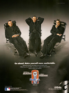
This Gillette advertisement mainly uses the aspect of reward to promote their product. The advert uses a simplistic layout and little colour to ensure that everything is made to look simple, the main text of the advert is 'Go ahead. Make yourself more comfortable.' promoting the idea that something as routine as shaving shouldn't be a hard thing to do. Gillette's slogan is 'The best a man can get', this in itself allows people to feel as though they are being rewarded, if it has been branded as the best, I believe the category of the succeeder, they believe they should reward themselves that could be more expensive as a treat for doing something good. The aspirer is driven by other people's perceptions of them, so they would want to have the best to ensure people think that way of them. This advert also uses elite persons as a way to show that different celebrities are supporting the product, the brand have chosen many successful athletes from various sports, to ensure that fans are certain sports are represented in this advert.
Subscribe to:
Posts (Atom)