The advert I have chosen to look at for humour is the Muller Corner advert, featuring ‘Daisy’ the cow’. The advert begins by us seeing the cow, Daisy, and that she has always wanted to be a horse. This immediately creates humour as it would be impossible for animals to be able to identify other animals, and want to be like one of them. Daisy is then shown to be running, like a horse, down a beach. This, added with the music also creates a sense of humour, as it is putting the cow in a romantic like way. As well as this, the over-voice we hear is of a man telling the cow to ‘go on girl, gallop’. The fact that a cow has been likened to a person creates humour as we are so prone to seeing cows behave exactly how they should be; like cows.
This in some ways possibly ties in
with the need to nurture. Although Daisy isn’t a tiny puppy, we still feel a
sense of ‘cuteness’ at any animal we see. The fact that this cow desperately
wants to ‘be a horse’, makes us feel sorry for her, which adds to both the need
to nurture but also the appeal of comedy and humour. The reason why a cow has
been used is because it relates to the products use of milk in its yogurts. The
advert is thanking ‘Daisy’, for her work towards producing milk, and so in
turn, Daisy is given the chance to be a horse.
Question 2. Use of slogans
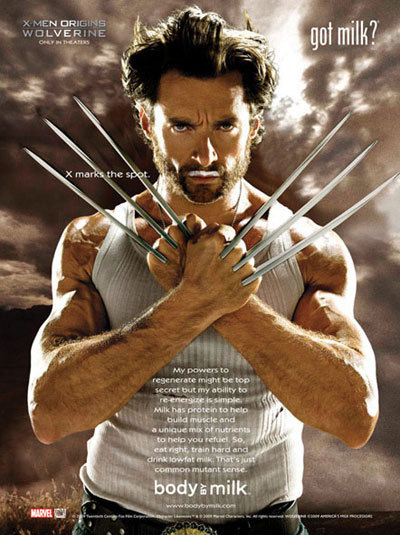
The advertisement using a slogan I have chosen to look at, is the ‘Got Milk?’ campaign. This simple slogan has become somewhat iconic, and is easily identifiable as to what is being advertised; milk. The campaign over the years has featured many celebrities, from Hugh Jackman as Wolverine, to Taylor Swift. This is perhaps why the adverts and slogan has become so recognizable, with the use of famous influential stars. The advert itself normally features a celebrity, and then above their lip, a ‘moustache of milk’.
The slogan itself applies directly to the consumer. It is asking them a simple question, and so therefore audience can easily form personal identification and relate to the brand. As it is only two words long, it short and easy to remember. This alone makes it iconic as something so simple can also have such an in-depth meaning. The advert in some ways can fit the basic appeals of Jib Fowles, under the ‘need for guidance’ category. The advert is implying if the consumer actually has something, and if not, they should go out and get it.

Question
3. The use of shock tacticsThis
advert was for the department store Harvey Nichols, in particular an
approaching sale. The advertisement itself features a female model, and the
store the logo. Underneath, the words ‘Try To Contain Your Excitement’. What
makes this advert shocking is that the model looks as if she has actually
urinated on herself. This is something that was seen to be hugely
controversial, as something considered so private and personal was being hugely
flaunted. The idea behind the advert is that the model was obviously so excited
for the upcoming sale, which as the advert says, she couldn’t contain her
excitement…
What makes this advert shocking is
the juxtaposition of two hugely different images. A pretty, glamorous model,
with the idea of her being able to ‘not contain her excitement’. This advert
was purposefully so controversial so that it became a huge talking point, and
was also easily memorable.
The
fact that a model was still used, ties in with the ‘Beautiful women’ appeal,
and also the need for aesthetic sensations. Although the idea behind the advert
may be seen as rude or unpleasant, it still identifies with the use of
glamorous people and lifestyles.
Question
5. Stereotyping in advertising
 This
advert for the aftershave Light Blue by D&G, hugely plays on the male
stereotype. The model, David Gandy, is made to portray an imagine of
masculinity and lust. By using a male model to advertise the product, it helps
create the perfect idea of what men should look like. David Gandy is obviously
considered handsome, and this is how men in the media are normally portrayed.
This
advert for the aftershave Light Blue by D&G, hugely plays on the male
stereotype. The model, David Gandy, is made to portray an imagine of
masculinity and lust. By using a male model to advertise the product, it helps
create the perfect idea of what men should look like. David Gandy is obviously
considered handsome, and this is how men in the media are normally portrayed.As David is looking directly into the camera, and wearing nothing but white trunks, the idea of sexuality and romance is also a key factor. Men are often seen as being lustful creatures who seek love, and so this also ties in with the basic appeal of sex. The backdrop for the advertisement seems to be an exotic getaway, with blue waters and beach coves in the distance. This creates the idea that the aftershave could possibly be considered as natural and exotic. Not only does this tie in with the appeal of glamorous places, but also nature & the natural world.
The reason the stereotype of the ‘man’ has been used in this advertisement, is so that men who go out and buy the aftershave after seeing the advert, may too feel like they can achieve to look like the adverts ideologies. Such as strength, good-looks, and above all, masculinity.
Question 6. Intertextuality in advertising
This advert features Lenny Henry, and was an advertisement in 2009 for Premier Inn. It features him dressed as a woman, recreating the iconic shower scene from the film Psycho; this being the intertextual reference. The advert changes from black and white, to colour. We are then shown a homely, warm looking hotel-room, and told that this is what you can expect by staying with Premier Inn, comparing the earlier Psycho-like footage to ‘nightmarish’ hotels.
This advert could possibly be aiming towards the safety needs, on the Hierachy of Needs theory. Every customer would obviously not want to be ‘murdered in the shower’, and so by staying here you would feel safe and warm in one of their rooms. In some ways, the audience would be rewarded by being able to identify and recognize the reference to the infamous horror film. Those who don’t, would still find the advert possibly amusing as they could still understand the idea behind it. According to Gillian Dyer, the advert would fit the lines of appeal in the following; art, culture & history, as well as comedy and humour. The advert uses all these techniques in attempting to make their advert memorable and interesting.
Question 7. Elite Persons in advertising
http://www.youtube.com/watch?v=YDnu7kxOgNc
Question 8. Reward & Punishment in advertising

The
following, was a famous super advert, lasting just over 2 minutes and featuring
Britney Spears. The product being sold was Pepsi-Cola back in 2001. The
advertisement itself features more like a music video than anything else, and
with using one of the biggest pop-stars at the time, it’s easy to see why. We
see what is implied to be a ‘Pepsi-making’ factory, with Britney and her fellow
colleagues deciding to burst into song and dance instead of actually working.
The main colours used in the advert are red, blue and white. This is obviously
prominent as the actual packaging of the product tends to have this colour
scheme. The video is accompanied by a song in which Britney sings about ‘the
joy of Pepsi’.
The use of Britney in this video
played a huge part. As well as being probably the most influential star of the
time, hence encouraging thousands of fans to buy the product she was seen to be
drinking, she was also the typical American sweet-heart. This perfectly fits in
with the image of Pepsi, being one of the favourite all-American drinks. The
colours of the product, red white and blue gives an insight into the state-side
background the item has. The lines of appeal for this advertisement would
obviously be successful careers, and elite people or experts.
Question 8. Reward & Punishment in advertising

The
advert I am looking at was an Anti-Alcohol campaign set up to discourage the
use of binge-drinking or over consumption. This advert uses the technique of
intertextuality, liking its advert to the ‘Absolut Vodka’ advertisements. This
is identifiably due to the use of the iconic white text at the bottom, starting
with the word Absolut. It is also recognizable with the central image of the
advert being an outline of a bottle of Vodka. In the actual adverts, in place
of this would be the actual bottle. This is one form of the reward in the
advert. Being able to recognize and identify the advert with that of the actual
Vodka campaigns.
The overall punishment is that the advert is actually promoting anti-alcohol, specifically drink driving. The outline of the bottle is drawn like a body print on the floor, with in the background being two cars which have obviously crashed together. We are made to believe that the reason for this is obviously drinking, as where the outline of a dead body should be, is actually the outline of the Vodka bottle. This obviously fits in with the need to feel safe, as nobody wants to be dead or seriously injured due to alcohol abuse. This acts as the punishment as it frightens the audience, and gives them an insight into exactly what could happen.
Another form of reward is that the advert is actually acting as a safety warning, telling people that this is what they shouldn’t do. The consumer of the advert is obviously capable of reading it, and so has not yet suffered serious problems due to alcohol abuse. The advert is reminding people that they are lucky, and to keep their wits about them whilst drinking.
No comments:
Post a Comment
What do you think?
Note: only a member of this blog may post a comment.